
The Silent Salesman: Mastering Food Truck and Cafe Menu Boards
Whether you are running a mobile food truck chasing the lunchtime rush or a cozy brick-and-mortar cafe looking to upsell a latte, the design and functionality of your menu board can make or break your sales. Here is how to master the art of the menu board for both settings.
In the bustling world of hospitality, your menu board is often the first point of contact between your brand and a hungry customer. It is more than just a list of items and prices; it is a marketing tool, a design statement, and a crucial decision-making aid.
Whether you are running a mobile food truck chasing the lunchtime rush or a cozy brick-and-mortar cafe looking to upsell a latte, the design and functionality of your menu board can make or break your sales. Here is how to master the art of the menu board for both settings.
Food trucks operate in an environment of sensory overload. Customers are standing on a sidewalk, traffic is noisy, and the sun might be glaring. Your menu board needs to fight through the clutter and communicate instantly.
1. Legibility is King
In a food truck, you have about three seconds to capture attention. High-contrast colors are essential. A black chalkboard with white lettering works, but so does a bold neon palette. Avoid script fonts that are difficult to read from three feet away. Use large, sans-serif fonts for item names and ensure prices are just as visible as the food descriptions.
2. The "Hero" Item Strategy
Space on a food truck is limited. Don’t list 30 items; list 8 to 12. Use the "Hero" strategy: designate your best-selling or highest-margin item as the star. Place it at the top center, perhaps with a small graphic or a "Best Seller" tag. This guides the indecisive customer toward your most profitable dish.
3. Exterior vs. Interior Boards
You need two boards.
- The Exterior Board: This is for the line. It needs to be visible from 10–15 feet away. It should feature the name of the truck, the top 3–5 items, and a clear "Order Here" sign.
- The Pickup Board: Located at the window, this board provides the finer details—ingredients, allergens, and sides.
4. Weatherproofing
Durability is non-negotiable. Chalkboards are aesthetically pleasing but can smudge in humidity. Consider printed vinyl banners, magnetic boards, or digital displays if your budget allows. Digital screens offer the advantage of changing the menu instantly when you run out of an item (the dreaded "86" list).
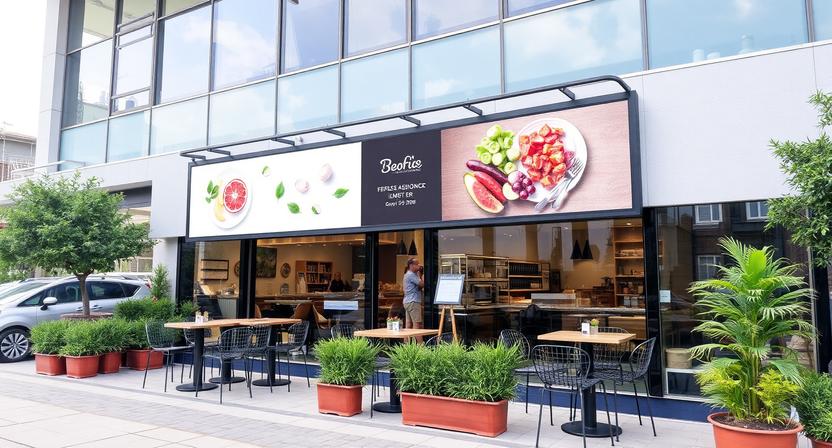
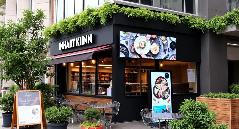
In a cafe, the customer experience is slower. The menu board is part of the interior design. It sets the mood for a morning coffee or a casual lunch meeting.
1. The "Z" Pattern and Eye Tracking
Studies show that customers read a menu board in a "Z" pattern (top left to right, then diagonal down to bottom left). Place your highest-margin items—like specialty lattes or avocado toast—in these zones. Put the staples (drip coffee, basic tea) at the bottom or in the corners.
2. Descriptive Copywriting
In a cafe, you have a moment to persuade. Instead of just writing "Turkey Sandwich," write "Roasted Turkey & Cranberry on Sourdough." Sensory words increase sales. Describe the roast of the coffee beans or the freshness of the pastries.
3. The Chalkboard Aesthetic
For many cafes, the hand-lettered chalkboard is the gold standard. It conveys authenticity, warmth, and human touch. If you lack a steady hand, consider hiring a professional chalk artist for a "menu refresh" every season. Alternatively, high-quality printed boards that look like chalk are easier to maintain and update.
4. Lighting Matters
Unlike a food truck, cafes have controlled lighting. Use spotlights or track lighting directed specifically at the menu board. If the board is poorly lit, customers will feel frustrated and may default to a standard order rather than exploring your specials.
Regardless of whether you are on wheels or in a building, some rules apply to all food truck menu boards:
- The Rule of 7: The human eye struggles to process more than seven items at a glance. Group your menu into categories (e.g., "Espresso," "Cold Brew," "Bites") to make it digestible.
- Price Anchoring: Avoid listing prices in a straight vertical line. When prices are aligned in a column, customers tend to order the cheapest item. Instead, place the price immediately after the item name, or stagger them so the eye has to work slightly to find the cost.
- The Decoy Effect: If you want to sell a $6 large latte, offer a $5 small and a $7 specialty drink. The $7 drink makes the $6 option feel like a reasonable middle ground.
- Update Frequently: A menu board with "Sold Out" stickers plastered over items looks unprofessional. Design your board with modular letters or digital screens that allow for quick changes.
Your cafe menu board is a silent salesperson. It works 24/7, answering questions, suggesting pairings, and influencing purchasing decisions. For the food truck owner, it must be bold, fast, and legible. For the cafe owner, it must be inviting, descriptive, and atmospheric.
Investing time and resources into professional menu design is not an expense; it is a direct strategy for increasing your average ticket size and building a loyal customer base.