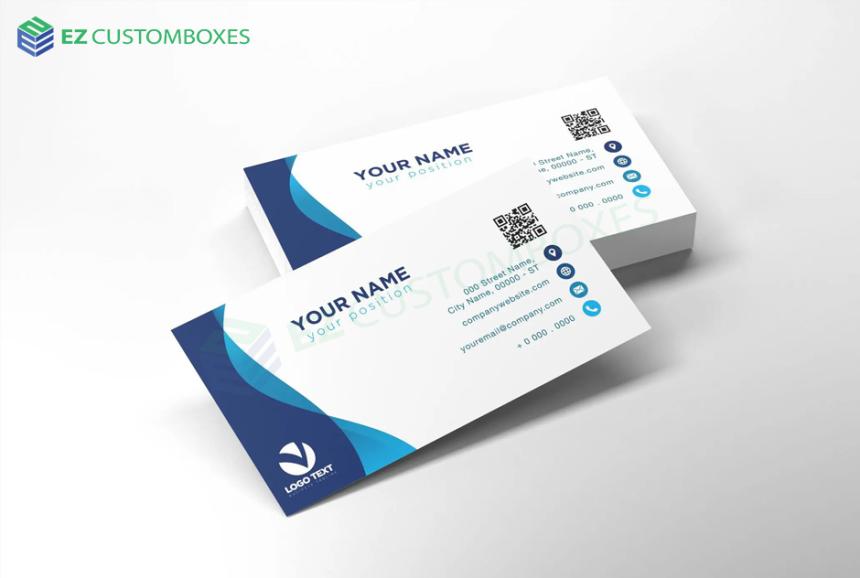

How Are Custom Business Cards Designed for Professional Networking?
Business cards are a professional introduction: who you are, how to contact you, what helps can you do to them. Business cards are not just a piece of printed paper but a networking tool. These cards are not randomly designed or chosen beacause it is attractive, but it is carefully designed. The goal behind designing the card is that people will remember you and can quickly find how to contact you; the most important part is that the card should portray the industry. A business cards
Business cards are a professional introduction: who you are, how to contact you, what helps can you do to them. Business cards are not just a piece of printed paper but a networking tool. These cards are not randomly designed or chosen beacause it is attractive, but it is carefully designed. The goal behind designing the card is that people will remember you and can quickly find how to contact you; the most important part is that the card should portray the industry. A business cards is the introduction of the brand, so it should be meaningful rather than just a decorative item.
The First Design Decision: What Should the Card Achieve?
Before designing the card, the designers should be aware of the aims of the card. Some people want their phone number to be highlighted; some cards need the recipient to remember both a person and a company, and so on. So, based on the aim, the cards have different appearances. The rule is that one card should give one clear professional message. The recipient doesn't need to search for their question.
Information Hierarchy Matters More Than Decoration
The card should follow the hierarchy; messy cards confuse the recipient. All the pieces of information will be placed according to their visual weight.
- Name
- Job title or role
- Company name and logo
- Phone number
- Email address
- Website
- Social profile
- Office address
- QR code
All these elements can't be printed at the same size and weight. The name and the contact details may be the strongest, which can be located easily. It can be tested: if we can read the card from a short distance means the hierarchy probably needs work.
The Logo Should Support Recognition, Not Take Over
Brands focus on the logo to be prominent on the card, as it represents their brand. But do remember that if the logo is too big and the person's name is too small, then it will not introduce the person but will look like an advertisement. So the text should be printed to highlight both the individual ad company and. For larger organizations, consistent logo placement across employee cards can also make the entire team appear more organized and established.
Typography Has a Practical Job
Typography is also selected carefully. If more stylish typography is selected but it's not readable, then it is not worth it. A custom business card is designed by focusing on:
- Readable text
- Strong contrast
- Line spacing
- No use of too many colors
- Consistent capitalization
So the text doesn't confuse the customer between a few letters, such as “o” and "0." The goal is not just to make typography attractive but effortless to read.
Color Should Create Recognition
Colors enhance the beauty of the card and make the customer remember it. Brands usually select the color palette based on the company’s existing identity. The colors also portray the brand personality, such as
For example:
- A kids' brand may use bright colors
- A technology company may use a modern palette
- A luxury brand may use refined finishing
Remember to choose the color palettes that are consistent with your website, social media, or custom box packaging so that customers will remember them. A business card should feel like a physical extension of the brand, not a separate design project.
The Back of the Card Is Valuable Real Estate
There are most of the cards where the back side is just plain. This side can be used for adding possible applications such as
- A short brand statement
- A QR code
- A service list
- A memorable visual
- A simple promotional message
- A useful industry-related reminder
Material Changes the Perceived Message
When the recipient holds the card, they judge the brand. The card's thickness, surface stiffness, and finish. That physical interaction contributes to perception.
Common choices include
Smooth cardstock:
Usually used by professional industries
Textured stocks
It gives a premium, artistic look and also gives a distinctive tactile experience.
Kraft-style materials
It can portray a handmade, sustainable, or natural brand identity.
Premium finishes
Foil, embossing, debossing, spot effects, and special coatings can make selected elements stand out.
Common Business Card Mistakes
Even experienced businesses can make surprisingly simple mistakes.
- Adding too much information
- So tiny text that can't be read comfortably
- Use of weak contrast makes the text disappear
- Use of a generic template which dont match the business
- Use of low-resolution images
- Inconsistent branding, which weakens recognition
- Just look the best on screen
If the brand chooses EZ Custom Boxes, they will get business cards that are perfectly aligned with their profession or company. They focus on each element, whether it's the material, design, finishes, presentation, or also the brand consistency.
To discuss your custom printing and packaging requirements, contact EZ Custom Boxes at [email protected] or call +1-888-515-1263.
NBA 2K27 Lightning Launch Guide for Beginners by U4gm
Lightning Launch in NBA 2K27 is about the first move from the perimeter: it helps a ball h...
Deburring and Surface Finishing with a Magnetic Polishing Machine
Every cutting operation leaves an edge. Sometimes the result is a visible curl of metal at...

Selecting the Right Magnetic Polishing Machine for Precision Component...
Buying finishing equipment looks simple until the first batch arrives. A machine that prod...
How a Magnetic Polishing Machine Works in Precision Surface Finishing
Precision metal parts almost always leave the machine shop with problems that drawings do...
How Can Scalable Web Applications Support Long-Term Business Growth?
