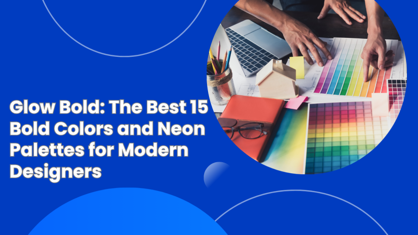

Glow Bold: The Best 15 Bold Colors and Neon Palettes for Modern Designers
Explore 15 bold colors and neon palettes that make modern designs pop. Perfect inspiration for your next creative project.
Color is more than just a visual element — it’s emotion, personality, and energy wrapped in one. And when it comes to catching eyes and making an impression, nothing does it better than bold colors and neon.
Whether you’re designing a brand logo, website, social media post, or packaging, the right color palette can instantly make your work stand out. Neon and bold colors bring vibrancy, excitement, and confidence — perfect for today’s modern, digital-first world.
In this blog, we’ll explore 15 amazing bold and neon color palettes that can give your designs an instant glow-up. Plus, we’ll share some simple tips on how to use them effectively without overwhelming your visuals.
Bold and neon colors are back — and they’re here to stay. From fashion to digital branding, you’ll find glowing blues, electric pinks, and vibrant greens everywhere. But why are designers so obsessed with them?
Here’s what makes them irresistible:
- They grab attention fast. In a world full of muted tones and minimalist styles, bold colors instantly draw the eye.
- They express energy and creativity. Neon tones feel alive, giving your designs a modern, futuristic touch.
- They make brands memorable. A strong, bright palette can help people recognize your brand instantly.
- They work beautifully on screens. Neon shades glow digitally, making websites, apps, and social media posts look dynamic and fresh.
Using bold colors and neon is about more than brightness — it’s about emotion, movement, and identity.
Neon colors are exciting, but they can easily dominate your design if not used carefully. Here are a few simple rules to help you make them work like magic:
- Start with balance. Pair neon tones with neutral shades like black, gray, or white to keep things sleek and professional.
- Use neon as accents. Let them highlight key elements — buttons, icons, or titles — rather than filling the whole page.
- Try gradients. Blending neon shades creates glowing effects that feel modern and smooth.
- Mind your readability. If using neon backgrounds, keep text dark and simple for clarity.
- Stay consistent. Don’t mix too many neon shades — pick a few that complement each other.
Now that you know the basics, let’s dive into the real show — the 15 best bold colors and neon palettes that modern designers are loving in 2025.
Colors:
- Electric Blue (#007BFF)
- Neon Green (#39FF14)
- Hot Pink (#FF007F)
- Deep Black (#000000)
This palette screams excitement. Perfect for tech startups, gaming brands, or youth campaigns, it brings bold energy and movement. The combination of blue and green feels digital, while pink adds playfulness.
Best for: Futuristic web design, esports brands, event posters.
Colors:
- Neon Magenta (#FF00FF)
- Turquoise (#00FFFF)
- Bright Yellow (#FFFF33)
- Deep Purple (#6600CC)
Inspired by the 80s neon lights and retro arcade vibes, this palette brings nostalgic fun with a modern twist. It’s bold, funky, and full of personality.
Best for: Music events, creative portfolios, retro-themed websites.
Colors:
- Lemon Yellow (#FFF700)
- Neon Orange (#FF6F00)
- Lime Green (#BFFF00)
- White (#FFFFFF)
Fresh, fruity, and full of life — this color mix feels like summer. It’s perfect for lifestyle, food, or wellness brands that want to radiate joy and optimism.
Best for: Food packaging, travel campaigns, fitness brands.
Colors:
- Deep Violet (#8A2BE2)
- Neon Cyan (#00FFFF)
- Hot Magenta (#FF00CC)
- Navy Black (#0B0B45)
This combination gives a nightlife or club vibe — mysterious yet electrifying. It’s great for brands that want to project confidence and creativity.
Best for: Music streaming apps, fashion websites, nightlife promotions.
Colors:
- Electric Blue (#00BFFF)
- Neon Pink (#FF10F0)
- Cyber Green (#00FF80)
- Charcoal Gray (#1E1E1E)
Think of this as your futuristic toolkit. It’s sleek, techy, and visually stunning — perfect for digital-first brands or innovative startups.
Best for: Tech agencies, UI/UX design, mobile apps.
Colors:
- Bright Orange (#FF4500)
- Neon Pink (#FF1493)
- Violet (#BA55D3)
- Golden Yellow (#FFD700)
Warm, glowing, and radiant — this palette mimics the beauty of a neon sunset. It’s full of movement and positivity.
Best for: Lifestyle influencers, photography portfolios, branding visuals.
Colors:
- Bright Red (#FF0033)
- Neon Yellow (#FFFF00)
- Black (#000000)
- Electric Blue (#0066FF)
This palette gives a graffiti-like street vibe — edgy and youthful. It’s ideal for brands that target a trendy, urban audience.
Best for: Sneaker brands, streetwear, or modern music campaigns.
Colors:
- Neon Orange (#FF6700)
- Aqua Blue (#00E6E6)
- Coral Pink (#FF5DA2)
- Lime Green (#BFFF00)
Bring summer to your designs with these vibrant tropical tones. They feel lively, fresh, and happy.
Best for: Travel websites, resorts, or summer campaigns.
Colors:
- Aqua Blue (#00FFFF)
- Deep Teal (#008080)
- Neon Lime (#32FF6A)
- White (#FFFFFF)
Cool, clean, and calming — this palette feels like neon under the water. It’s modern, refreshing, and versatile.
Best for: Health, spa, and wellness brands.
Colors:
- Bubblegum Pink (#FF69B4)
- Sky Blue (#00BFFF)
- Lemon Yellow (#FFF700)
- White (#F8F8F8)
Fun, soft, and inviting — this sweet combination works beautifully for cheerful and youthful brands.
Best for: Kids’ products, lifestyle brands, and confectionery.
Colors:
- Electric Purple (#BF00FF)
- Aqua Green (#00FFBF)
- Neon Pink (#FF00AA)
- Dark Blue (#001F54)
This palette draws inspiration from the Northern Lights — dreamy, magical, and bold. Perfect for giving a touch of fantasy to your visuals.
Best for: Photography, digital art, and creative agencies.
Colors:
- Cyber Green (#00FF00)
- Deep Violet (#8000FF)
- Magenta (#FF0090)
- Black (#000000)
This futuristic palette screams innovation. It’s bold, confident, and perfect for modern tech or gaming designs.
Best for: Software startups, gaming websites, AI platforms.
Colors:
- Neon Yellow (#FFFF33)
- Asphalt Gray (#2E2E2E)
- Bright Red (#FF3300)
- White (#FFFFFF)
Sharp and modern — this palette creates the look of glowing city lights against concrete. It’s energetic but balanced.
Best for: Automotive brands, urban blogs, or architecture sites.
Colors:
- Neon Purple (#BF00FF)
- Aqua (#00FFFF)
- Hot Pink (#FF1493)
- Sky Blue (#87CEEB)
Playful, energetic, and lighthearted, this palette brings out the fun side of design. It feels trendy and modern.
Best for: Beauty products, youth marketing, and digital stores.
Colors:
- Bright Pink (#FF1493)
- Neon Blue (#00BFFF)
- Light Purple (#DA70D6)
- Soft White (#F5F5F5)
Elegant yet powerful, this palette combines feminine energy with bold confidence. It’s eye-catching and perfect for clean, modern visuals.
Best for: Fashion brands, influencers, and lifestyle creators.
If you’re ready to make your design shine, here’s how to use these palettes like a pro:
- Use contrast wisely: Pair a neon color with a dark or muted background to make it pop.
- Keep the text legible: Neon tones look great, but readability matters more.
- Go for gradients: Blending two or three neon hues creates soft glowing effects.
- Highlight, don’t overload: Use neon to emphasize call-to-action buttons or key visuals.
- Test on screens: Always preview neon shades on multiple devices to ensure consistent glow.
In 2025, brands are embracing creativity like never before. Minimalism ruled for years, but now, designers are using bold colors and neon to stand out in a sea of sameness.
From tech companies to fashion brands, everyone wants visuals that express confidence and energy. Social media platforms like Instagram and TikTok have also pushed neon back into the spotlight — glowing gradients, bright overlays, and luminous typography are everywhere.
Simply put, bold colors and neon represent modern creativity. They’re fearless, expressive, and full of life.
A great neon color palette can completely transform your design — and bold colors and neon do that instantly. They add excitement, draw attention, and make your visuals unforgettable.
Whether you’re refreshing your logo, designing a website, or crafting your next campaign, try experimenting with these 15 bold and neon color palettes. Each neon color palette is vibrant, versatile, and designed to make your work shine in today’s digital world.
So go ahead — mix, match, and create.
Your next design might just be the one that lights up the world.



Influence of Surfactants on the Formation and Growth of Cadmium Tellur...